
我迫不及待地想要一些“空闲”时间,这样我就可以为我的项目添加样式。一点点交互性可以给页面增添活力。
你想要一只漂浮的猫吗?没问题。我使用 ai 制作了一张猫的图像,并在 illustrator 中“手动”提取了背景,为我的 .png 图像获得了漂亮的剪切效果。嘭。猫。
让他移动一点,这样他看起来就像是漂浮的。我最喜欢的 css 动画之一是轨道。它真的很有用,你可以用它做很多事情。
猫在视图中,我将我的猫的图像带入并为其分配类别“cat”
现在,在我的 css 文件中,我构建了“cat”的样式。在 cat 中,我们将动画称为“轨道”,如下所示。
.cat {
  animation: orbit 3s infinite linear;
}

@keyframes orbit {
  from {
    transform: rotate(0deg) translatex(15px) rotate(0deg);
  }
  to {
    transform: rotate(360deg) translatex(15px) rotate(-360deg);
  }
}
在这里您可以看到,我们“从 0 度角度开始旋转猫”,距离 x 原点 15px,从 0 度开始。
猫在 15px 处绕了一整圈 360 度,一直绕了一圈。 -360 的第二次旋转抵消了第一次旋转,使猫保持直立。如果你只看动画就更容易了。 xd。
我们只是稍微移动了他,因为我们不希望他在页面上飞来飞去。足以令人兴奋。
向左一点,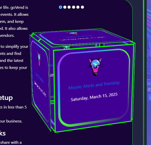
向右一点。
魔法!
立方体我之前学过如何用 css 创建立方体。虽然这很好,但我今天有了一个疯狂的想法,即以动态的方式重新使用立方体。我想用实时数据填充立方体表面。就像说,接下来的一些即将发生的事件。就像在登陆页面上发现一件有趣的事情一样。为什么不呢。这很令人兴奋。
因此,我在视图中构建了骨架。我们的立方体毕竟需要一个家。
我有一些单选按钮,以便用户可以与多维数据集进行交互。
每个单选按钮都会显示不同的立方体面。
我循环添加想要在每个面上显示的信息:
  <div class="cube-container">
      <input class="radio-button" type="radio" name="cube-gallery" checked/>
      <input class="radio-button" type="radio" name="cube-gallery"/>
      <input class="radio-button" type="radio" name="cube-gallery"/>
      <input class="radio-button" type="radio" name="cube-gallery"/>
      <input class="radio-button" type="radio" name="cube-gallery"/>
      <input class="radio-button" type="radio" name="cube-gallery"/>
        <div class="cube">
        <% upcoming_events = event.where('started_at > ?', date.today).order(:started_at).limit(6) %>
        <% upcoming_events.each do |event| %>
          <div class="cube-side intro col">
            <p><% if event.photo.present? %>
                <%= image_tag url_for(event.photo), width: "75px", height: "75px", alt: "default photo" %>
                <% else %>
                <%= image_tag "bulb.png", width: "75px", height: "75px", alt: "default photo" %>
              <% end %>
            </p>
            <p><%= link_to event.name, event_path(event.id) %></p>
            <p><%= event.started_at.strftime("%a, %b %d, %y") %></p>
          </div>
        <% end %>
      </div>
    </div>
处理 css 有点麻烦。特别是对于视口之类的。这不是移动设备的答案,但它可以在更大的屏幕上工作并发挥作用,哈哈。我就把这个留给你。接受处理小屏幕尺寸的建议。
/*===========
rotating cube
==============*/

.cube-container {
  width: 30vw;
  height: 40vh;
  text-align: center;
  perspective: 100em;
}

.cube {
  width: 100%;
  height: 100%;
  position: relative;
  transform-style: preserve-3d;
  transition-duration: 2s;
  border: 5px solid transparent;
  margin-top:100px;
  display: block;
}

.cube-side {
  position: absolute;
  width: 300px;
  height: 300px;
  background-color: rgb(64, 0, 148);
  border: 1px solid white;
  background-position: center;
  background-size: cover;
  border: 4px solid lime;
}

.cube-side:nth-child(1){
  transform: rotateY(0deg) translateZ(10em);
}

.cube-side:nth-child(2){
  transform: rotateY(90deg) translateZ(10em);
}

.cube-side:nth-child(3){
  transform: rotateY(180deg) translateZ(10em);
}

.cube-side:nth-child(4){
  transform: rotateY(-90deg) translateZ(10em);
}

.cube-side:nth-child(5){
  transform: rotateX(90deg) translateZ(9.75em);
  border-top: 8px solid lime;
  border-bottom: 8px solid lime;
}

.cube-side:nth-child(6){
  transform: rotateX(-90deg) translateZ(9.3em);
  border-top: 8px solid lime;
  border-bottom: 8px solid lime;
}


/* cube radio buttons */

.radio-button {
  transform: translateX(-50px);
}

.radio-button:checked ~ .cube{
  transition-duration: 3s;
  transition-timing-function: cubic-bezier(0.19. 1, 0.22, 1);
}

.radio-button:nth-child(1):checked ~ .cube {
  transform: rotateX(-15deg) rotateY(20deg);
}

.radio-button:nth-child(2):checked ~ .cube {
  transform: rotateX(-15deg) rotateY(180deg);
}

.radio-button:nth-child(3):checked ~ .cube {
  transform: rotateX(-15deg) rotateY(90deg);
}

.radio-button:nth-child(4):checked ~ .cube {
  transform: rotateX(-15deg) rotateY(-90deg);
}

.radio-button:nth-child(5):checked ~ .cube {
  transform: rotateX(-105deg) rotateY(0deg);
}

.radio-button:nth-child(6):checked ~ .cube {
  transform: rotateX(75deg) rotateY(0deg);
}
每个按钮和侧面都是单独处理的。我很想看到一个更优雅的解决方案(如果存在)。
我真的很兴奋它成功了。
感谢您的浏览!
以上就是漂浮的猫和立方体的详细内容,更多请关注知识资源分享宝库其它相关文章!
版权声明
本站内容来源于互联网搬运,
仅限用于小范围内传播学习,请在下载后24小时内删除,
如果有侵权内容、不妥之处,请第一时间联系我们删除。敬请谅解!
E-mail:dpw1001@163.com


发表评论